08.07.2026
Creative Vision, Local Insight: How Zoyes Helps Shape Chicago’s Urban Fabric
For a creative agency, there is no canvas quite like Chicago. At Zoyes Creative, our journey in the Second City has been one of steady, strategic immersion, evolving from a partner on individual landmarks to a permanent fixture in the city’s creative ecosystem.
Our recent launch of Belmora for Mavrek Development signifies our growing presence in a market that demands a sophisticated blend of heritage and future-forward vision. Today, with a dedicated full-time presence and a continually expanding portfolio of the city’s most recognizable addresses, Zoyes Creative is heavily invested in Chicago.
Revitalizing a Landmark: The Chicago Board of Trade Building
The Challenge: Repositioning Heritage for a New Era
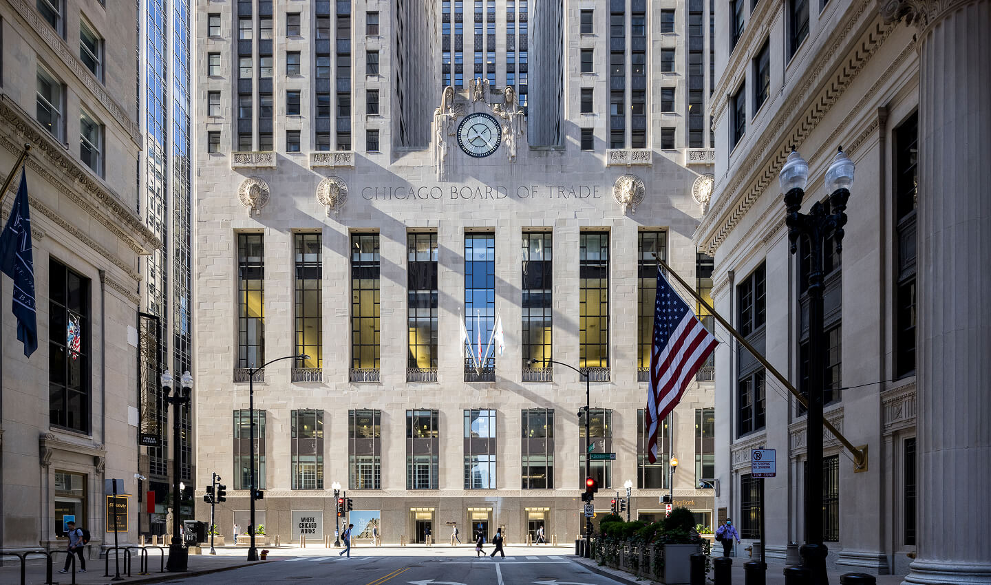
Few buildings carry the weight of history like The Chicago Board of Trade Building. An Art Deco masterpiece anchoring the financial district, its silhouette is synonymous with the city’s economic might. However, even an icon can evolve. The challenge was clear: how do we reposition a century-old symbol as a future-forward workplace without losing its legendary stature?
The Solution: “Take Your Seat at the Board”
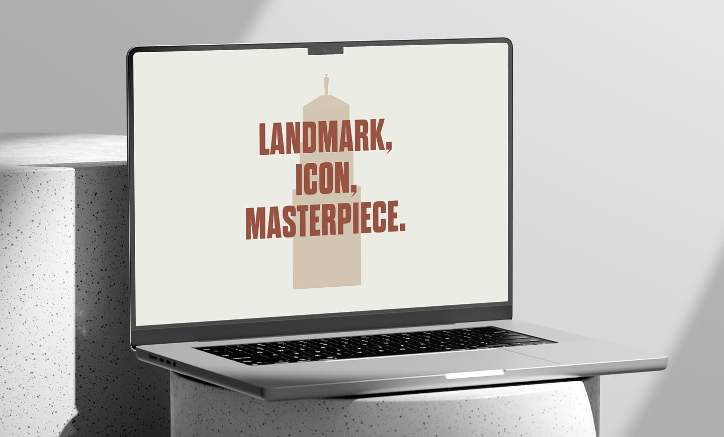
Our approach: develop a brand that celebrates 1930s grandeur while embracing 21st-century perspectives. We leaned into the sense of pride Chicagoans feel for this land-mark, creating an identity system inspired by its most iconic physical features: the imposing silhouette and the goddess Ceres overlooking LaSalle Street. Through a series of evocative headlines like “Iconic by Nature” and “Where Chicago Works,” we revitalized the building’s narrative. The result was a comprehensive branding system, including a new digital experience and a robust wayfinding system, that ensures the Board of Trade Building remains a destination for another century of greatness.
Defining the Skyline: The Diamond at 150 North Michigan
The Challenge: Transforming a Silhouette into a Brand
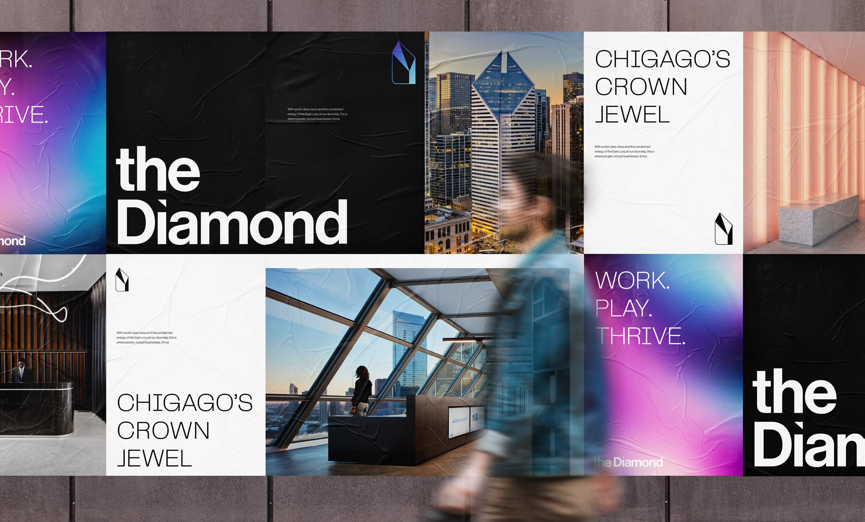
The skyscraper at 150 North Michigan has always been one of Chicago’s most recognizable skyline profiles, but it lacked an enngaging brand identity that matched its physical presence.
The Solution: The Diamond
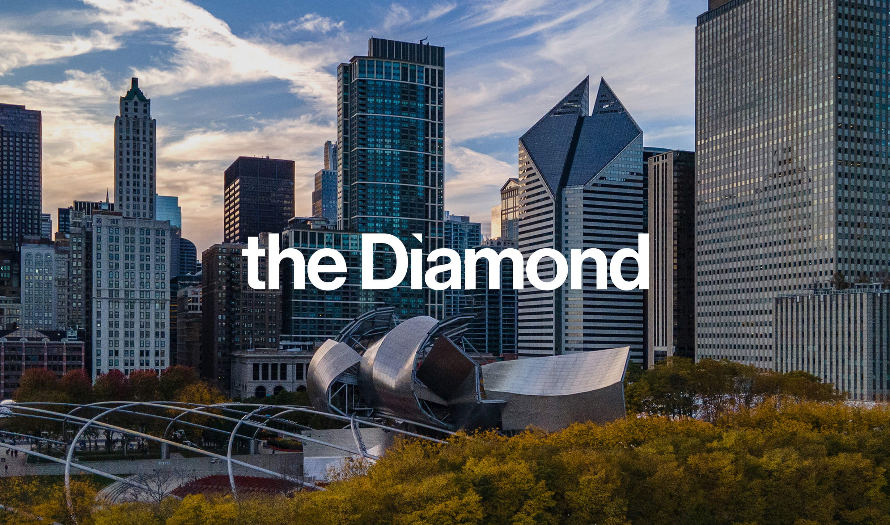
We renamed this landmark building ‘The Diamond‘, a title that leverages the building’s most distinct feature and renowned architectural design. The logo and visual identity were derived directly from the building’s defining physical characteristics: its faceted, sloped roofline. By distilling architectural brilliance into a sleek brand system, we helped reposition The Diamond as a masterfully crafted environment for high-value tenants.
Boutique Urbanism: Introducing Belmora
The Challenge: Standing Out in Lakeview
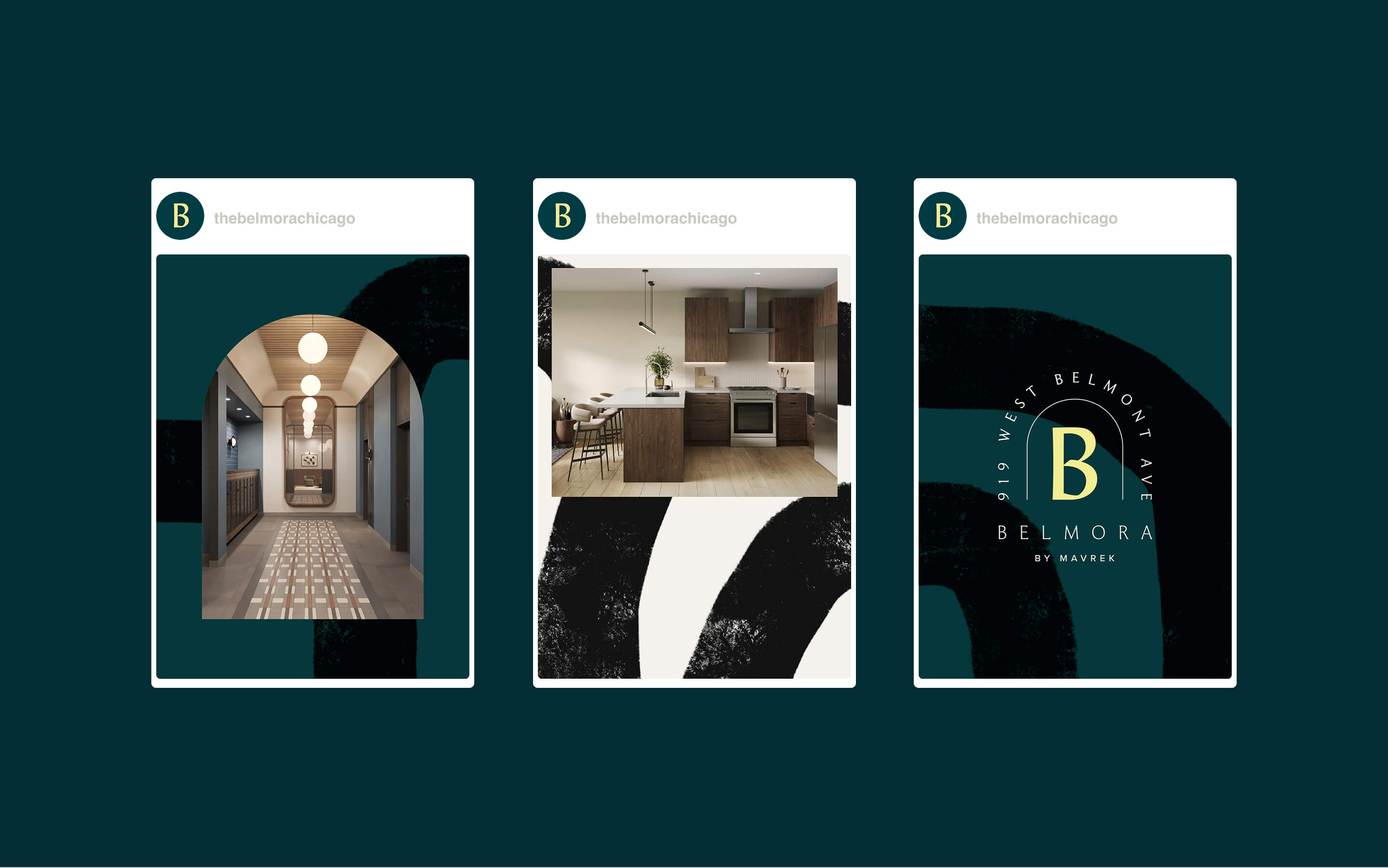
In the vibrant, competitive neighborhood of Lakeview, creating a 46-unit mixed-use development requires more than just good architecture; it requires a brand that resonates with the curated urban lifestyle of the modern Chicagoan. For Mavrek Development, the goal was to create a destination that felt boutique, intimate, and distinctly Lakeview.
The Solution: A New Residential Standard
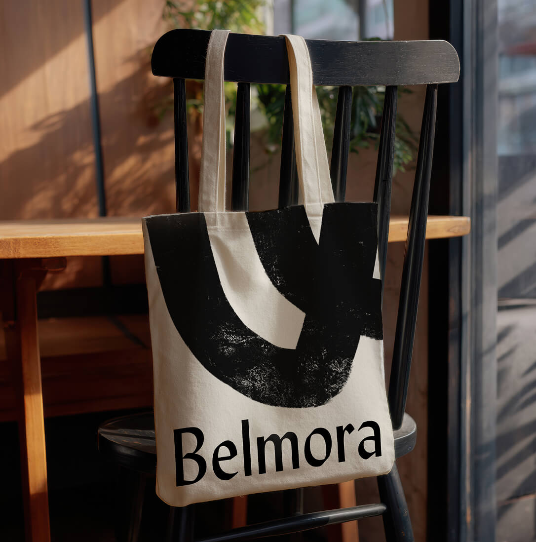
We launched Belmora as a brand that encapsulates the essence of intensional living. From the naming to the visual identity, every choice was designed to communicate a sense of refined, accessible luxury. Belmora is more than a place to live; it is a meticulously designed environment that bridges the gap between the historic charm of Belmont Avenue and a modern residential experience.
Expanding the Experience: Waterview and REFF Chicago
Our work in Chicago extends beyond residential and commercial towers into the realms of hospitality and industry leadership.
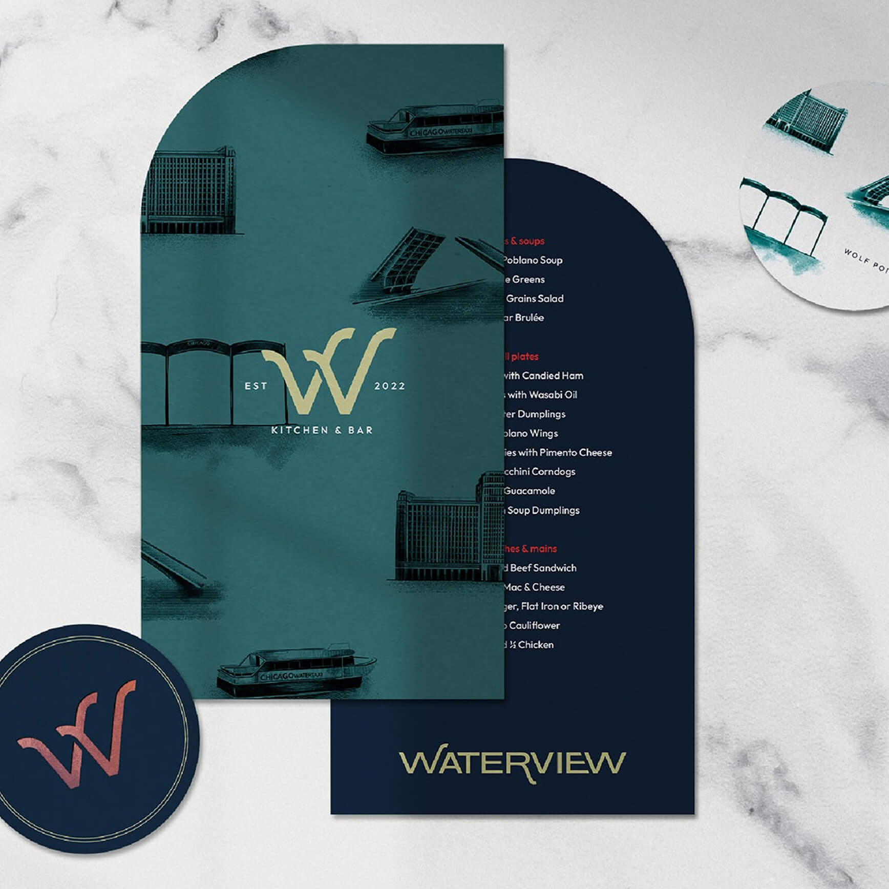
- Waterview: Located at the iconic Wolf Point, Waterview is a hospitality-focused food-and-beverage experience. We created a brand that celebrates the sensory experience of the water’s edge, utilizing vibrant streetscapes and custom lighting narratives to define the destination.
- REFF Chicago: Our involvement with the Real Estate Finance Forum (REFF) underscores our commitment to the professional community that builds this city. By partnering with the organizations that drive development, we ensure our strategic insights are aligned with the capital and vision moving the market forward.
A Commitment to the Market
Zoyes Creative’s growth in Chicago is not accidental. It is a calculated expansion fueled by our belief that the built environment deserves world-class storytelling.
With a full-time presence and a growing team on the ground, we are more than just a creative partner; we are local experts who understand the nuances of the Chicago market: from the historic corridors of the Loop to the emerging streetscapes of Lakeview.
“We’ve partnered with Zoyes on numerous projects over the years, and they continue to impress every time. The team is not only deeply creative and full of fresh, edgy ideas, but also incredibly prompt, kind, and easy to work with. Zoyes brings design expertise, strategic thinking, and gen-uine passion to everything they touch.”
Andrew Marty, Madison Rose
A Legacy in the Making
Chicago is a city of big shoulders and even bigger visions. At Zoyes Creative, we are honored to help the architects and developers of this transformative city communicate their value. Whether revitalizing a landmark or launching a groundbreaking new development, we are here to ensure your project doesn’t just exist in the city: it defines it.
Ready to elevate your next Chicago project? Connect with our team to see how we can bring strategic branding and transformative design to your property.