10.07.2026
An Urban Oasis Inspired by the Rhythm of Nashville
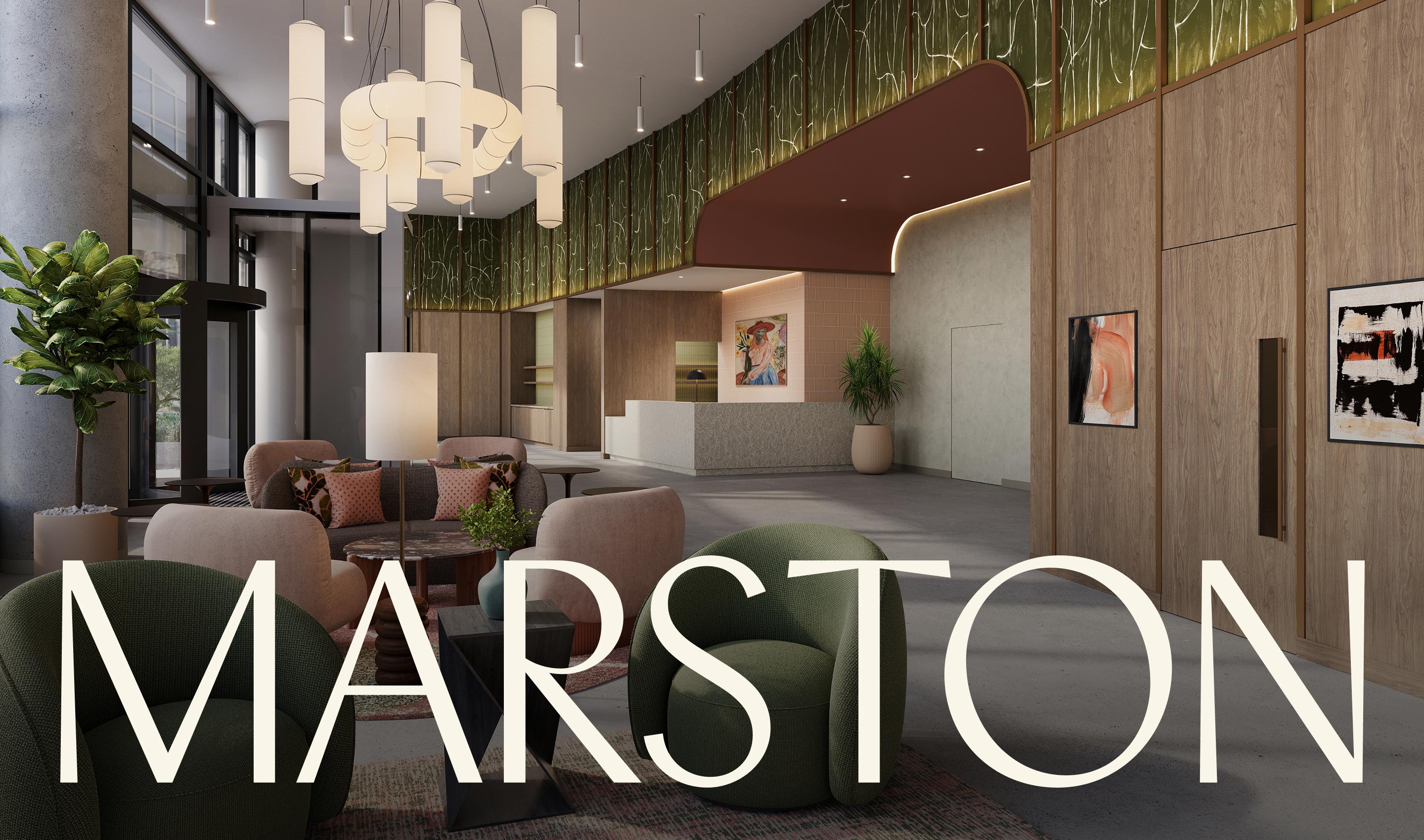
Nashville has never been a city that stands still.
Its streets carry the energy of live music, independent creativity, and a distinctly generous form of southern hospitality. On Music Row, that energy is especially concentrated. The neighborhood’s cultural legacy is substantial, but its future is equally compelling: a landscape where new residences, restaurants, creative spaces, and landmark developments are reshaping how people experience the Music City.
For Marston, a new 245-foot residential tower with 396 residences, the brief was clear: create a brand with the stature to stand out in Nashville’s evolving residential landscape, while remaining warm enough to feel like home. We were proud to collaborate with LG Group, a Chicago-based developer with a thoughtful approach to property development on this project. Together, we created a brand identity, digital experience, and suite of visual assets designed to position Marston as more than a luxury residence. The goal was never simply to stand out, it was to belong: to Nashville, to Music Row, and to the people who will call Marston home.


The Challenge: Creating Calm in a City in Motion
Music Row is one of Nashville’s most dynamic neighborhoods. Its history is inseparable from the city’s musical heritage, but its identity cannot be reduced to nostalgia. The neighborhood continues to evolve, attracting new residents and new forms of creative expression while retaining its independent spirit.
Marston needed to enter that landscape with confidence. The project’s scale demanded a brand with visual impact. Its amenity-rich offering—including a rooftop pool deck, library, and private dining room—called for a refined sense of luxury. At the same time, the architecture and interiors were conceived as a tranquil urban retreat, an oasis of calm in the midst of an energetic city.
The challenge was to hold these ideas in balance:
- Landmark presence without visual excess.
- An inviting senes of quiet luxury.
- Contemporary design without losing cultural character.
- A strong identity that could communicate both stature and warmth.
For a property of this scale, branding is a strategic tool that helps define perception from the first impression through the lived experience. That is where our expertise as a real estate focused branding agency begins.
The Solution: an Urban Oasis with its Own Rhythm
Through conversations with the LG Group team, we developed a narrative foundation for Marston: an urban oasis for people who want to put down roots in a growing city. This positioning gave the brand a clear emotional center. Marston was not presented as an escape from Nashville’s energy, but as a place that helps residents move through it with greater intention: a setting for stillness, creativity, and belonging. The idea of being “Rooted in Rhythm” connected the property to Music Row without relying on overt musical references. It acknowledged the neighborhood’s cultural pulse while expanding the story into something more personal: the rhythm of daily life, community, ritual, and home. That distinction mattered.
Building a Distinctive Visual Identity
Every component of the identity was designed to support the larger positioning.
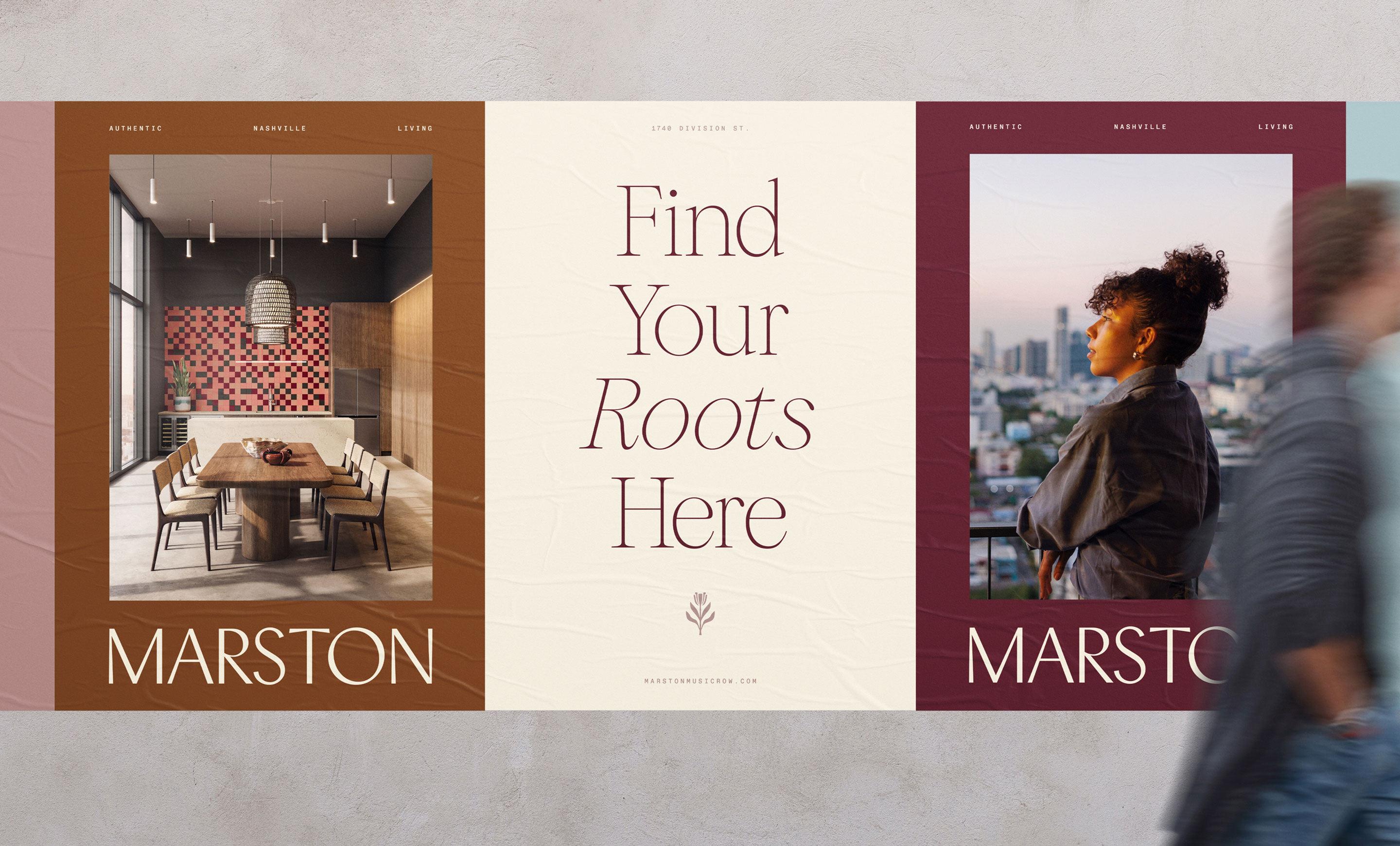
The primary wordmark is bold, composed, and confident. Its structure gives Marston a sense of permanence and edge, while its softer character reflects the warmth of the building’s interiors. The result is a mark that can hold its own across a tower-scale exterior application, a digital interface, or a more intimate printed piece.
Color played an equally important role. Rich Merlot and Copper establish a grounding presence, giving the identity a material quality that feels connected to warm interiors, evening light, and the layered character of Nashville. Sky Blue, Dusty Rose, and Cream introduce openness and ease, preventing the palette from feeling too dense or overtly formal. Together, the colors create a visual language that feels refined but approachable: an important distinction in luxury real estate branding.
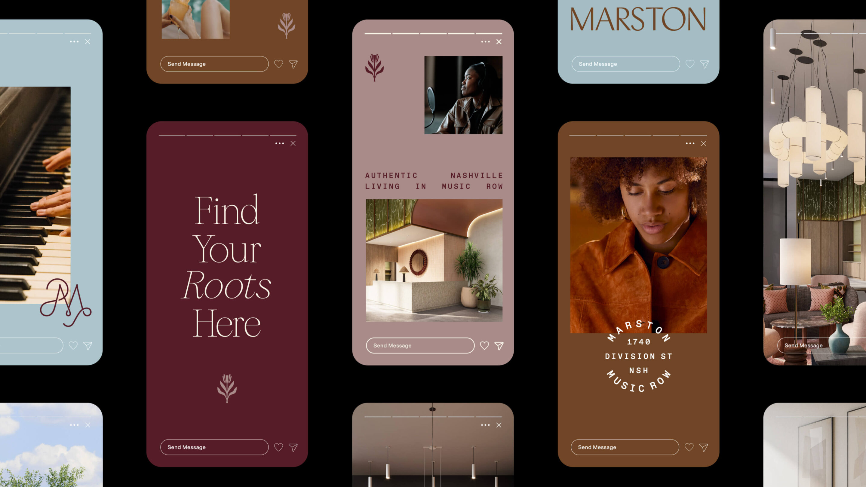
Typography extends that balance. Stylish serif headlines bring a sense of heritage and editorial confidence, while a contemporary monospaced font introduces a more modern, independent voice. The pairing is timeless without being traditional and distinctive without becoming difficult to use. We also developed a series of supporting marks, each with a strategic role:
- A printmaking-inspired floral mark adds a tactile, human quality
- A casual crest gives the brand a sense of place and belonging.
- A refined monogram provides a more elevated expression for select applications.
These elements nod to Nashville’s independent spirit and vibrant rhythms, but they do so with restraint. Rather than illustrate the neighborhood literally, they create an identity that feels culturally aware, visually flexible, and capable of lasting beyond the launch moment.
Translating Architecture into Experience
Marston’s architecture was led by Norr, with interiors by Offshoot Creative. Their shared design directive was to create a tranquil urban retreat that honors the energy and creative history of Music Row. Our role was to compliment and expand on that that vision, through the brand, story and visual expressions.
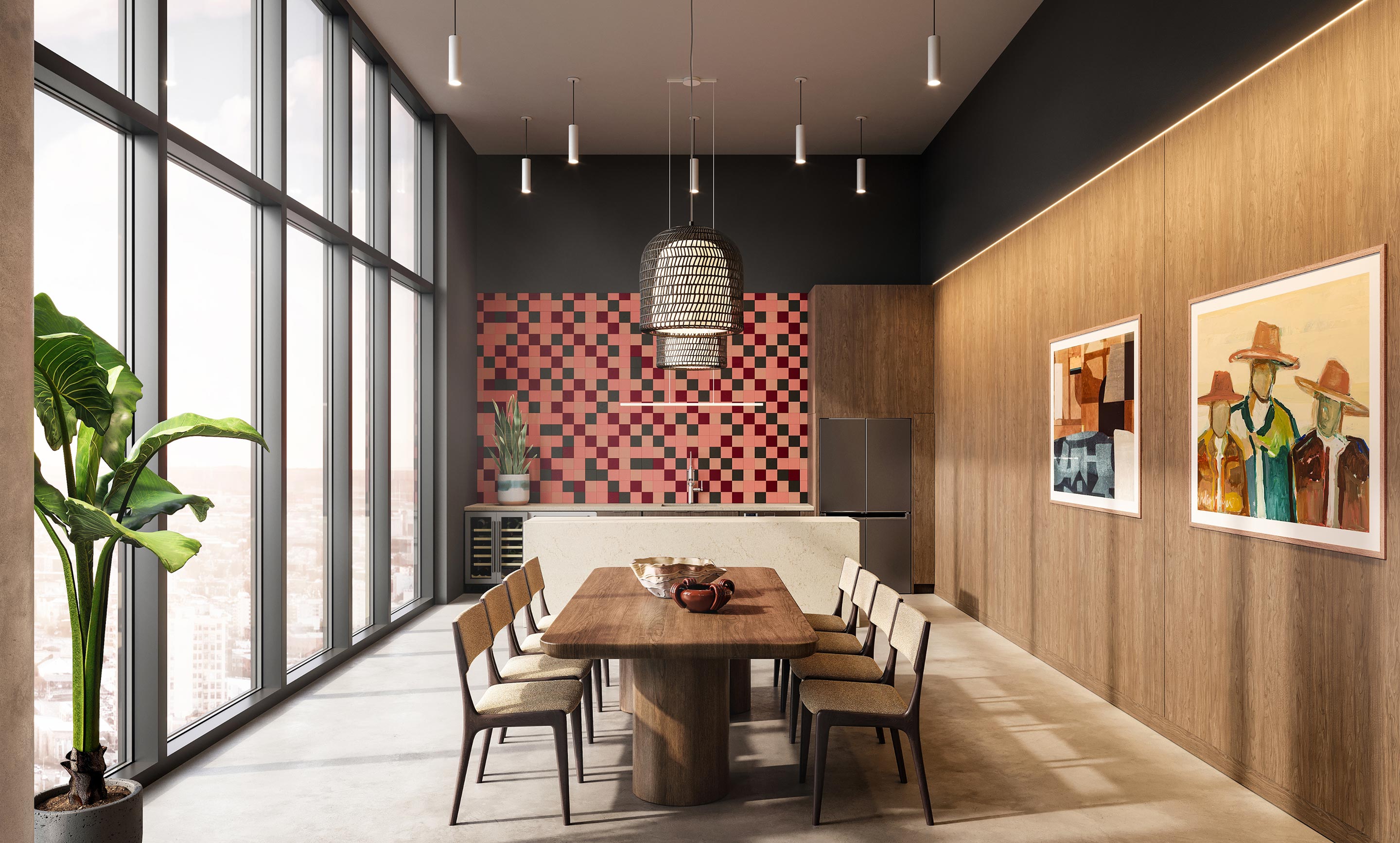
We created an extensive suite of renderings that captured the design intent across the property, from the chevron-like geometry of the exterior to the organic curves of the lobby ceiling. The imagery was developed not merely to show spaces, but to communicate how those spaces would feel. Warm wood tones, handmade tile, layered rugs, and locally curated art were rendered with tactile richness. Custom lighting adds a soft glow to shared spaces, while carefully composed views establish a sense of arrival, pause, and immersion.
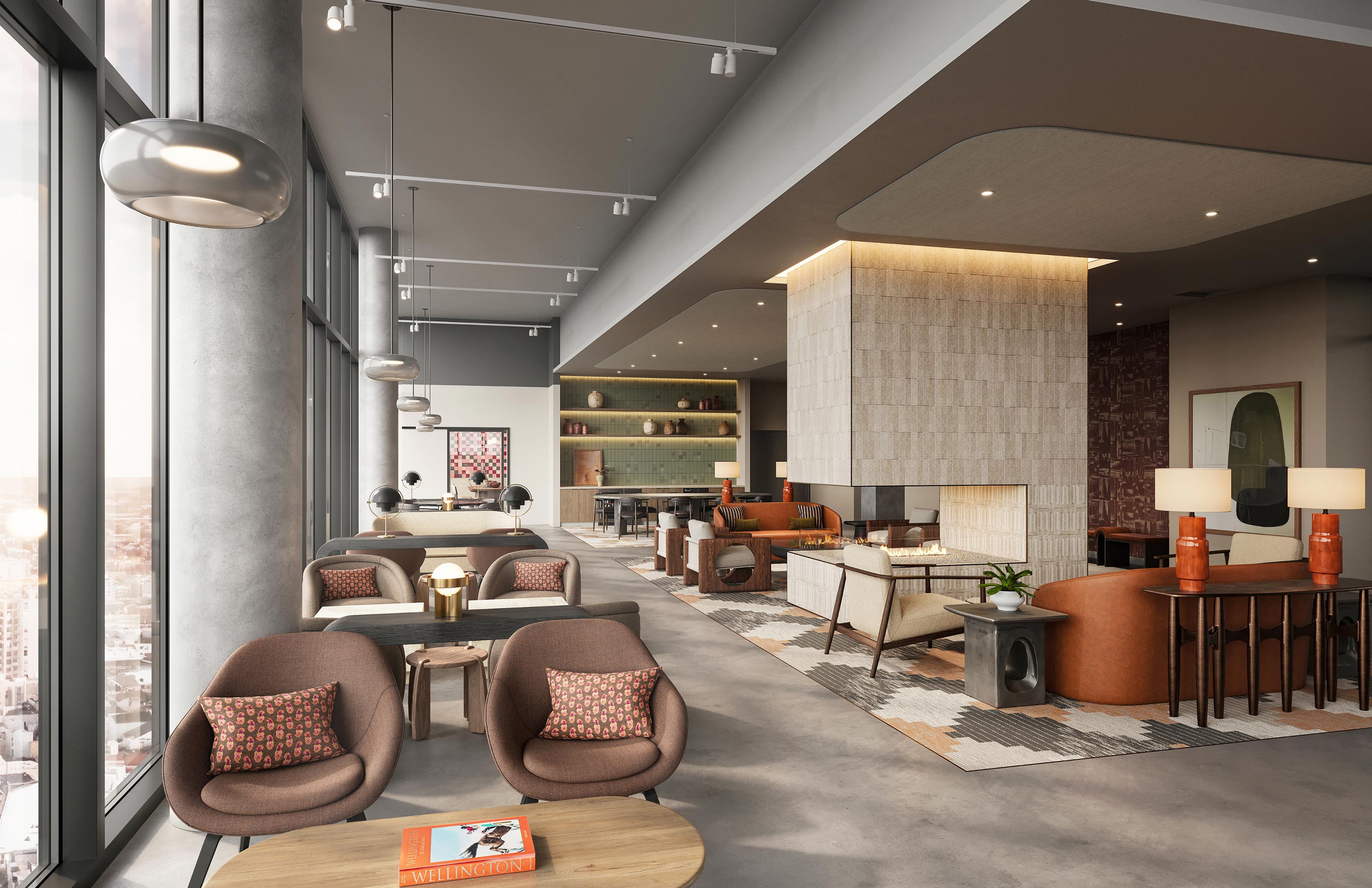

This level of visual storytelling is essential in property development branding. Before a resident steps through the doors, the brand must help them imagine the experience: gathering around a private dining table, moving through a calm and welcoming lobby, reading in the library, or watching the city shift beneath the rooftop pool deck.
A rendering is most effective when it does more than document architecture. It communicates atmosphere, aspiration, and human possibility.
From First Impression to Lasting Connection
Marston’s brand system was designed to work across every touchpoint in the resident journey. The website, in particular, had to do more than list residences and amenities. It needed to introduce Marston as a way of living: one that values thoughtful detail, deep connections, and the balance between vibrant streetscapes and private restoration.
This is where our work as a creative agency for real estate intersects with experience design.
We consider how a project is discovered, understood, visited, remembered, and ultimately inhabited. A strong brand should continue through signage, collateral, amenity spaces, resident communications, and the everyday rituals that make a place feel familiar. For Marston, consistency creates confidence. The brand’s warm palette, composed typography, and expressive details work together to establish a recognizable point of view across the full landscape of the property.
A New Chapter for Zoyes Creative
Marston also marks an exciting step for Zoyes Creative: bringing our built-environment branding expertise to Nashville.
Our work has always been grounded in the relationship between place and perception. We help architects, developers, and placemakers articulate what makes a project meaningful, then translate that insight into identities and experiences that connect with people. Nashville offers a particularly rich context for that work. It is a city with a powerful sense of cultural authorship, a growing development landscape, and an audience that understands the value of authenticity.
For an agency focused on branding for architects, property developers, and visionary real estate teams, it is an inspiring place to contribute. Marston gave us the opportunity to collaborate with LG Group on a project that respects history while looking decisively forward. It demonstrates how strategic real estate storytelling can help a landmark property become part of a larger cultural landscape.

The Work Behind the Brand
Our scope for Marston included:
- Creative direction
- Brand strategy
- Brand design
- Digital strategy
- Architectural and interior renderings
- Web design and development
Credits included:
- Developer: LG Group
- Architecture: Norr Architecture
- Interior design: Offshoot Creative
- Branding, digital, and visualization: Zoyes Creative
Explore the full Marston case study and discover how strategic residential property branding can help a new development integrate with the city it calls home.