Shaping the future of an educational institution.
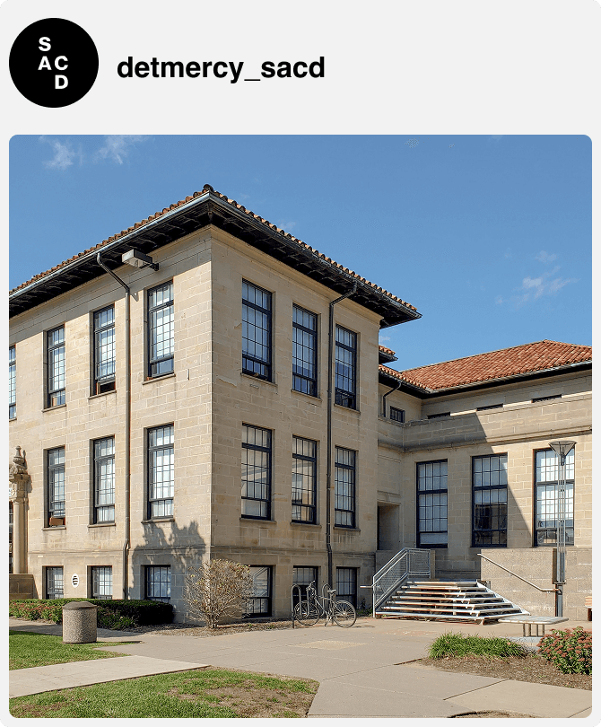
The University of Detroit Mercy School of Architecture and Community Development (SACD) is an internationally recognized leader in the education of students who will lead the ever-changing disciplines of architecture, urban design, and community development.
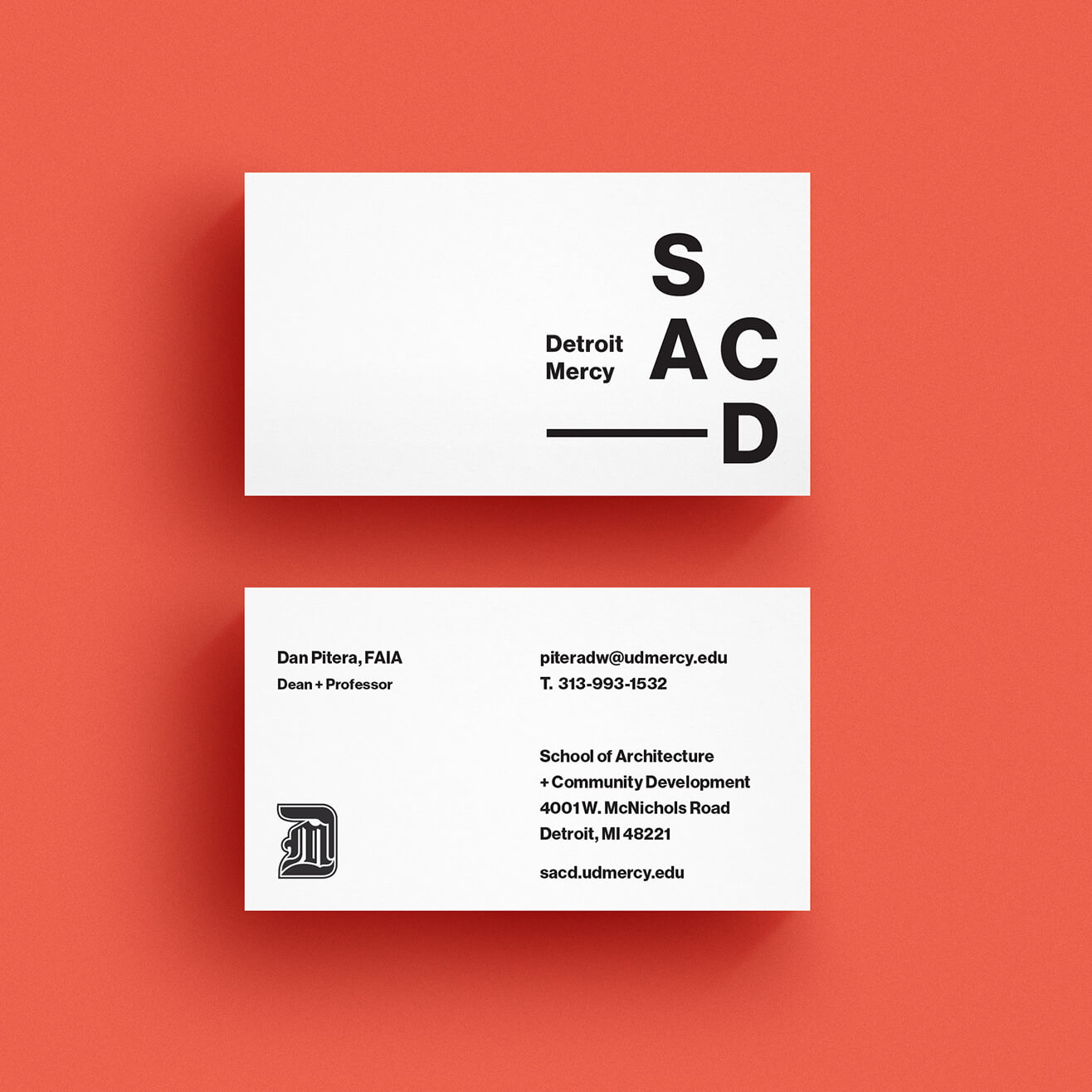
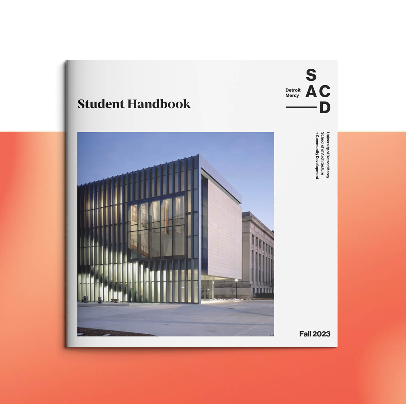
Our work was centered around this core mission — driving a dynamic new brand identity that reflects the School’s values of diversity, inclusivity, equity, community, and education.
Client
University of Detroit Mercy
Detroit, MI
Scope of Work
- Brand Strategy
- Brand Design
- Copy + Messaging
- Digital Strategy
- Print Design
- Web Design + Development

