Reimagining an urban
transit system.
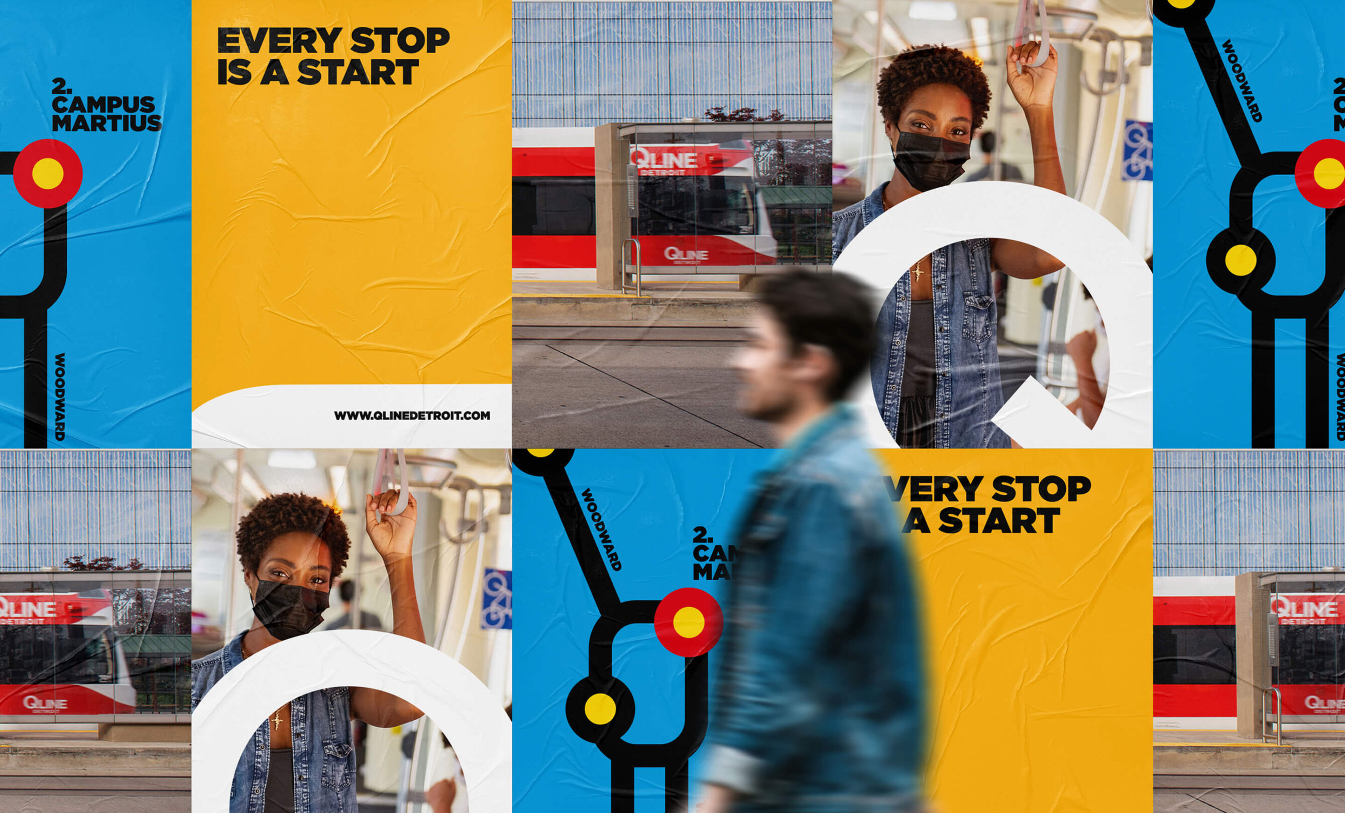
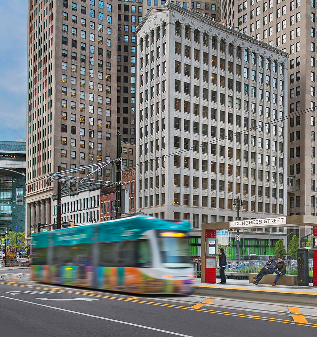
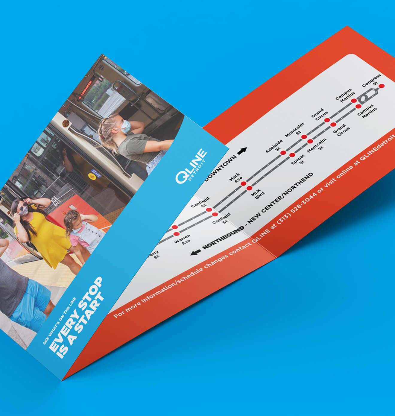
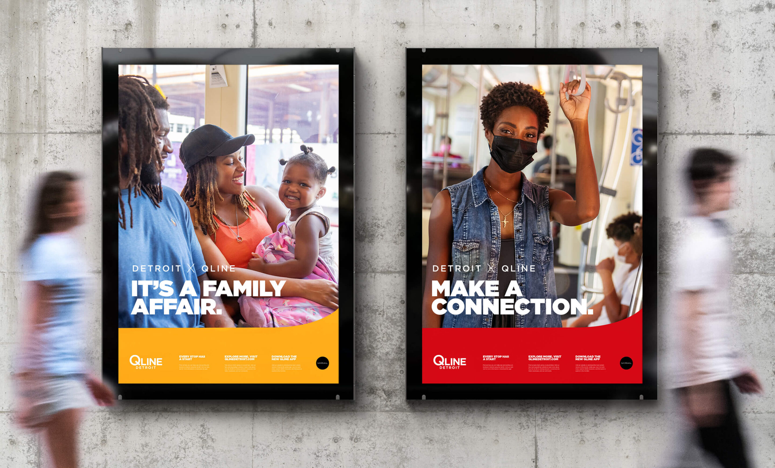
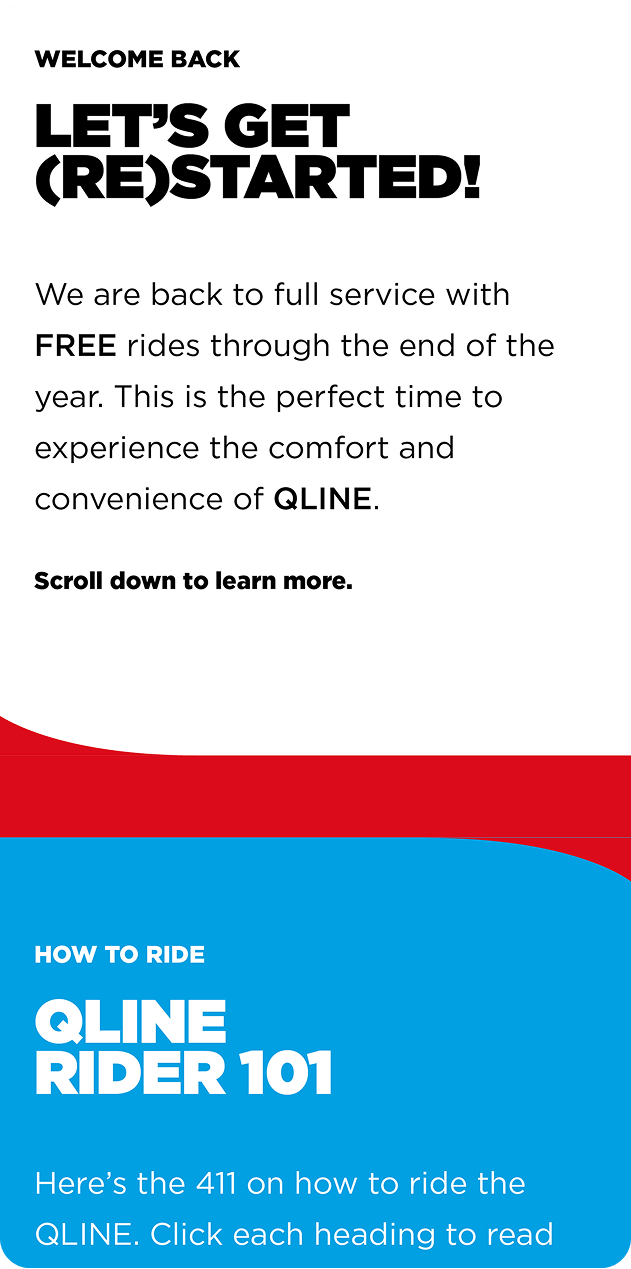
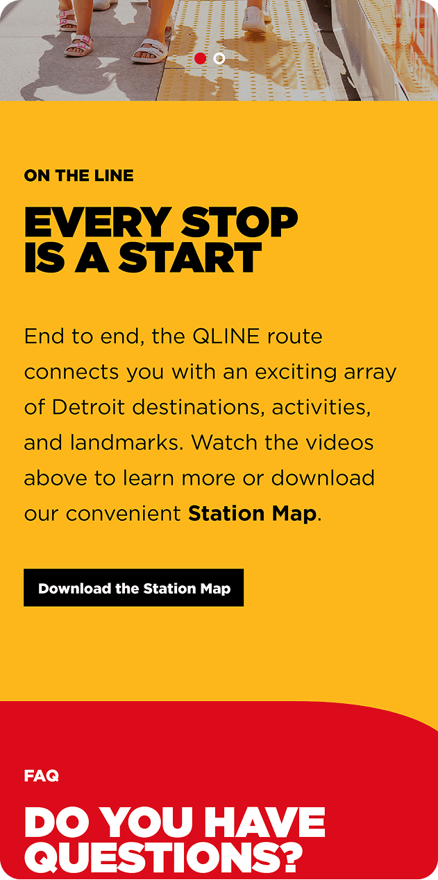
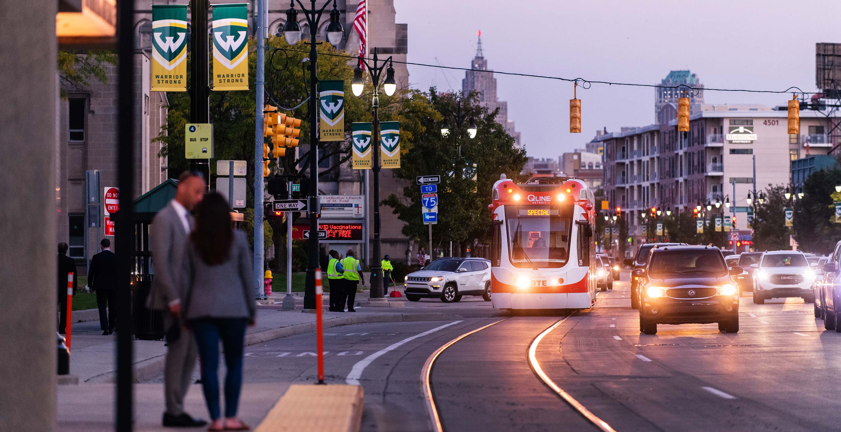
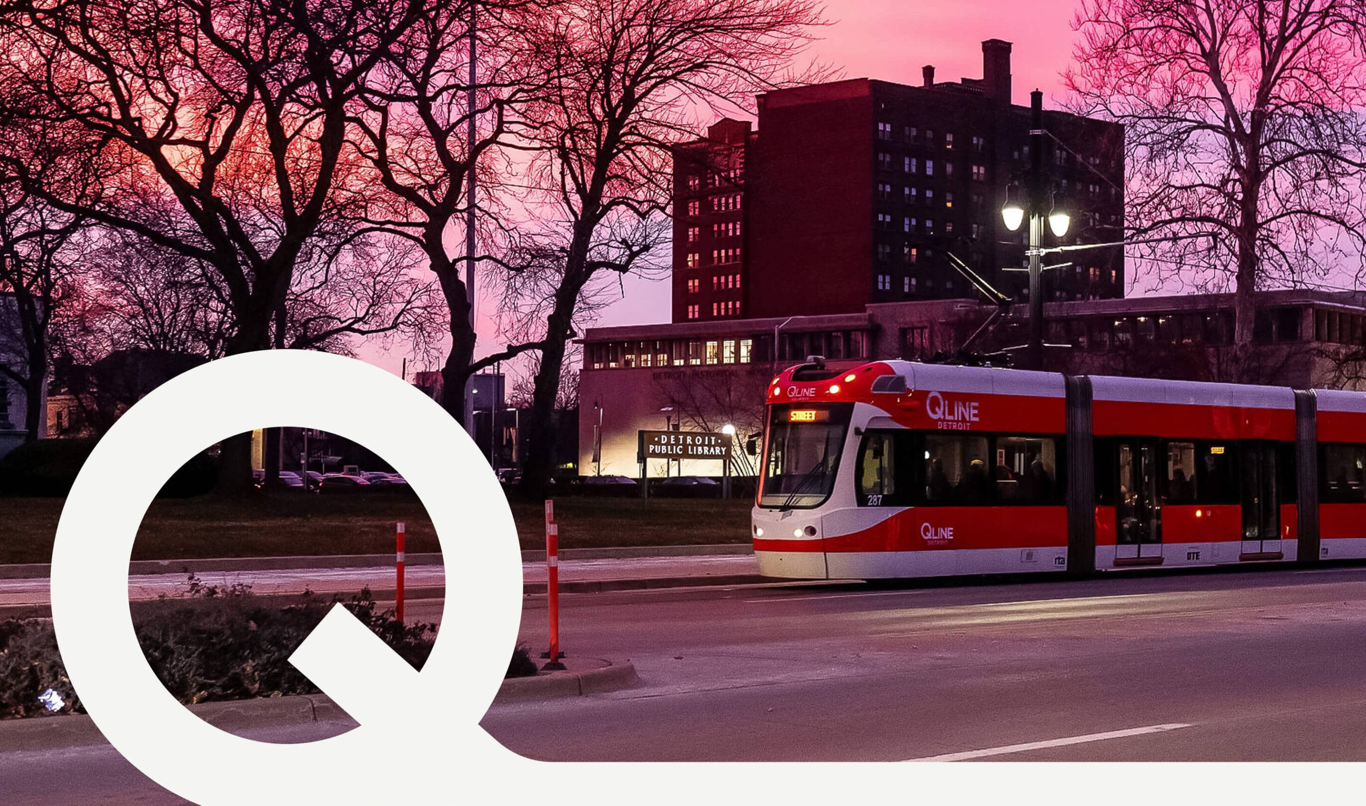
With a plan to re-launch in the post-COVID landscape, Detroit’s QLINE had a renewed focus: establish itself as the most convenient way to experience the city’s Woodward Corridor while setting a new standard for successful public transit.
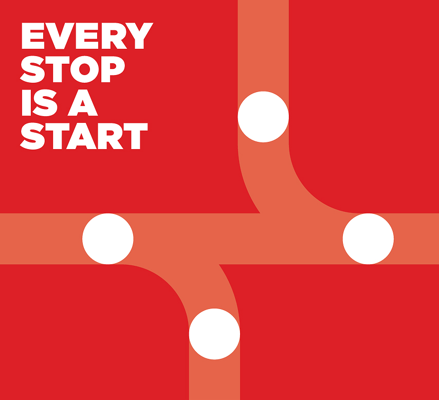
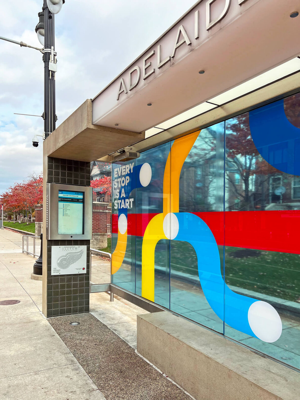
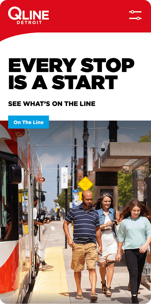
Rooted in research and discovery, our evolution process refined the brand’s focus, positioning it as a safe, reliable, and inclusive experience. With accessibility as a key component to the QLINE’s success, it was important for the communication and visual language to reach and connect with a broad range of potential riders, all with different needs and perceptions.
Client
M1 Rail
Detroit, MI
Scope of Work
- Brand Strategy
- Brand Evolution
- Copy + Messaging
- Branded Environments
- Web Design + Development